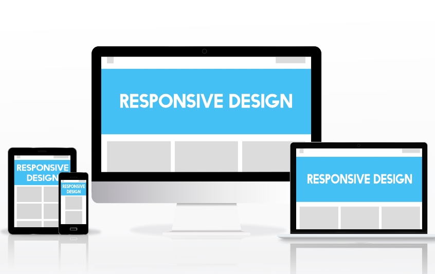
The work of web developers reaches more and more people, since the internet can be visited from multiple devices. Making a responsive web design with HTML5 and CSS3 is what will allow a project to be much more functional and adaptable, as it will be able to be viewed without difficulty on mobile phones, tablets, or anywhere else.
This responsive design implies that the elements that appear in the screen adapts to navigation and to the use of any resolution. Having phones and other devices with different sizes, different resolutions and even their own browsers and operating systems; it is important to accommodate the greatest number of them.
Tips to get a responsive web
Before we dive into how to make a responsive web page with HTML and CSS, we will give you some tips that you should always keep in mind.
- Usability: Your web page must be available for use from any device, and this involves very small terminals. Be concise and eliminate what does not contribute.
- Maximum adaptability: As you can imagine, preparing an entire layout design for a computer is very different from doing it for mobile, where you will find a column or at most three.
- Essential audiovisual elements: Both images and videos must adapt to the size of the screen, although we recommend removing all those that are not essential. They take up a lot of space and load time.
- Think digital: And we’re not referring to the online world, but to the fact that mobile phones and tablets are operated with your fingers. The size of a cursor is significantly smaller than your fingertip, so you’ll need to adjust the buttons.
- Avoid the scroll horizontal: They are not comfortable to use in the mobile versions, while the Vertical scroll is what we use the most.
Techniques for a responsive design
Viewport in the meta tag tag
Most mobile browsers use HTML scaling according to a fixed width that fits the screens. If we use the metatag viewport we can tell the browser which width to respect, disabling scaling by default. This code must appear inside the head tag.
Average Queries
The media queries are CSS3 properties that, broadly speaking, allow us to include conditions to a style sheet. In this way, we will have the possibility to show the same content in different ways, using a variety of designs that will adapt to the device on which it is shown.
Max-Width and Min-Width
These two CSS properties play a very important role in cross-platform design, since thanks to them we can prepare different structures. These properties allow us to set the minimum and maximum width an element can receive, which is significant when using percentages as the value of CSS properties, and helps us set a scaling limit.
Relative measurements
Using relative measurements will allow the responsive design to fit properly to the window in which it is displayed. Using these percentages is very useful for margins, font sizes or padding. With this we will get a much more uniform design, with more balanced elements and a better user experience.
Adapt the font size to the design
- Pixels (px): Setting the size of a font in pixels is almost like choosing its fixed size, although it actually takes the resolution of the device as a relative measure. In this way we will be able to define exactly the size we want for the letter, but also that it does not fit precisely into the available visual space.
- Points (pt): Although it is a measurement usually used in documents for printing, we also see it present in CSS. It is a size based on inches (an inch is 72 points), and it varies a lot depending on the browser and the screen. It is not recommended to use it if you want to make a responsive design, as well as other measurement units such as centimetres, millimetres, or the inches themselves.
- Ems (em): It is one of the measures that work best when we need adaptability, since it is a scalable format. Take as reference the element containing the text, although it can give us some problems if we have a very complex code, because it respects the hierarchical order of the elements.
- Percentages (%): Similar to ems, with percentages it is very easy to scale the size of a font. 1 em would be equivalent to a font size of 100%, in case you need to change your formatting values.
Test with emulators
Finally, the best way to get a responsive design that works on most devices is to test it yourself. There are numerous emulators that faithfully recreate the experience of mobile device users, and here you can find the possible failures of your website.
Now you know some of the tricks and techniques that enable the correct responsive web design with HTML5 and CSS3. Developing an adaptable web is not simple, because it involves a greater number of hours in the project, but the user’s perception will be much better. At Doowebs, we are specialists in web design and development in Valecia. Contact us to take your project to the next level!
