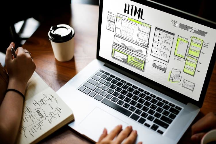
Do you know the importance of web design on your site?
Imagine you are walking through a mall. What is it that invites you to enter a store you don’t know? On many (many) occasions… The showcase!
Whether you are looking for something specific or not, the display case is an essential element to attract customers to a business. When you enter, the second phase begins: the order of the products, the design of the store, the prices, the customer service…
In the digital world it works in a similar way, but you have to keep something in mind: the client’s intention is not always the same.
Why is good web design important?
In this case, there is a significant difference between the two types of customers: rush. Nobody wants to waste time on the Internet, and this type of client knows what he is looking for. Therefore, he will not enter your page by mere chance (at least, not in most cases).
“Did you know that it takes the average user 3 seconds to decide whether to stay on a website?”
During those three seconds, most expect to land on a well-designed page that is intuitive and gives you the information you need. Although the content must be relevant, the design also plays a leading role in this search.
What is the goal of web design?
The web design is of decisive importance for the first impression. It may sound cliché to you. However, it is undeniable that your site continues to be the letter of introduction of your business.
In this sense, web design has three main objectives to meet with the client:
- Provide a intuitive interface and easy to navigate.
- Transmit the values of the brand or company.
- Guarantee a response or action from the user.
Elements needed for an optimized web design
Already being aware of the importance of a good web design, see what elements will help you meet these objectives:
Subpage organization and division
Lay out the menu, categories, buttons, related product modules, and banners in a smart way. Each of them must have a block and an appropriate space that is comfortable to look at and easy to click.
Desktop and responsive version
Today, traffic analysis reveals the following: most of the visits no longer come from computers, but from mobile phones. That is why we suggest adapting your design to desktop and responsive to guarantee a better user experience.
Typography and content
The font you have chosen must be legible without abusing the size, bold, italics, etc. This applies both to the skeleton of the site and to advertising elements (banners or pop-ups) and general content.
➔ Learn how to add typography to a website.
Palette or range of colors
When it comes to viewing experience, maintaining consistency is vital colors in the spaces of the site. In other words, all your online or offline products must be consistent with the corporate image of your business.
Call-to-action
It’s not all about color! What’s the use of having the site organized if you don’t guide your users?
You see, the calls to action, or calls to action, are located in different sections of the page and within the buttons of the advertising banners. This in order to encourage the visitor to do something specific.
For example, e-commerces have a “Buy” button within their product file. In the case of blogs, these include the “Subscribe” CTA. And, generally speaking, websites have a section to invite them to contact you or the customer support team.
Only in this way will you be able to keep track of the elements that you have incorporated, and verify if you have achieved the conversions that you expected.
Audiovisual content
Would you like to add photos, images, or illustrations? Good. Even if you plan to include videos, there is no problem with that either. As long as these elements are correctly integrated into the design, consistently, and do not take time to load.
There is nothing more annoying than waiting for an image to download little by little. Or have a video pause every second, and spend forever trying to see it through to the end.
That being said, go for good resolution images that are less than 100 kB in size . As for the videos, upload them in .mp4 format as it maintains a high quality, is compatible with all browsers and weighs less.
Let’s get to work
Before you go live your site, review your to-do list to make sure you meet all of the above points.
If you want more visits and more sales, always keep in mind the importance of web design when creating the marketing strategy. If your design is optimal, you will obtain greater control and better analysis of results.
Do you need a custom design for your website? At Doowebs, we are experts in web design. Request a budget without obligation!
