There are not many occasions in which you are given the opportunity to land in San Francisco with the team of Digital Minds of the School of Art and Design of Barreira, and a few other professionals, to attend a week of workshops and sharing. With the designers and creatives who are part of the big technology companies.
The entrance to the city already says it all, as you leave left and right, the offices of Slack, Google, IBM, and the imposing Salesforce building looms on every corner. It is clear that this trip promises, and this is a way to summarize everything lived in an intense week of work and discoveries.
Airbnb: the value of storytelling
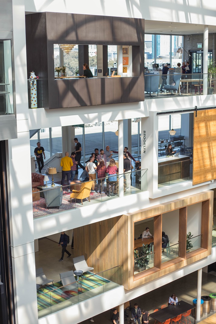
You can not help but be a little speechless when you walk through the door of the Airbnb offices on Brannan St and enter a space so bright, with so much presence of natural plants, and of course, with a design that achieves harmony and surprise in parts the same.
Hayley Hughes -Design Lead- acts as a hostess and introduces us to the history and business culture of Airbnb, and like any experience it is better to live it than to tell it – and in that they are great experts – she guides us through the four floors that make up the building so that we can see how they work and, above all, confirm that Airbnb’s philosophy reaches every corner.
The second part of the day on Airbnb we spent with Lumen Bigott -Experience Designer at Airbnb- in which we focused on the verticality of professional profiles in companies of this size and the advantages of feeding from such diverse and multidisciplinary work teams .
Lumen is currently part of the team of designers who are developing the new experience service offered by Airbnb and shared with us the tools they use to give and receive feedback.
The feedback between a team of considerable size and consists of over a hundred designers may seem impossible, but this company is key to align objectives, provide greater added value and Lumen stressed the importance of these form tasks of the work routine, either in meetings with one of the CEOs, or spontaneously among colleagues.
Google Design Sprint: Apply the methodology with those who know the most
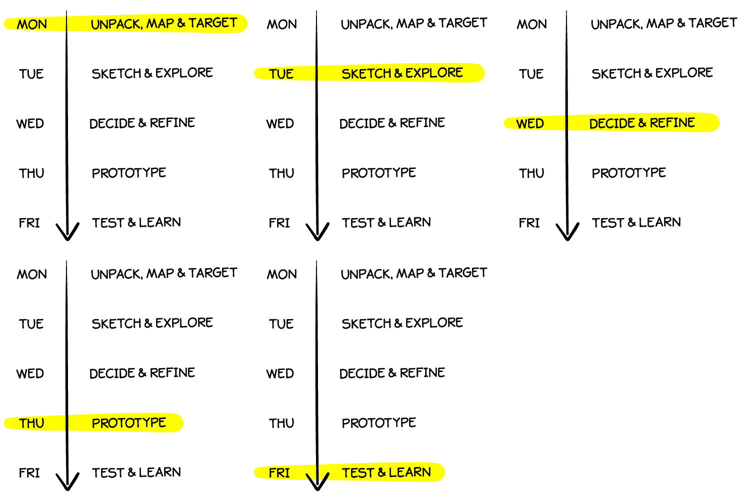
Without dwelling too much on the theoretical foundations of this way of working, it is an agile methodology created by Google Ventures in 2014, as a way to give greater dynamism in the development of startups in which the technology giant invests.
It is not a 100% original innovative methodology, but it has managed to combine the most relevant of Design Thinking, the principles of Lean and the essence of Scrum, all packaged in a 5-day work process.
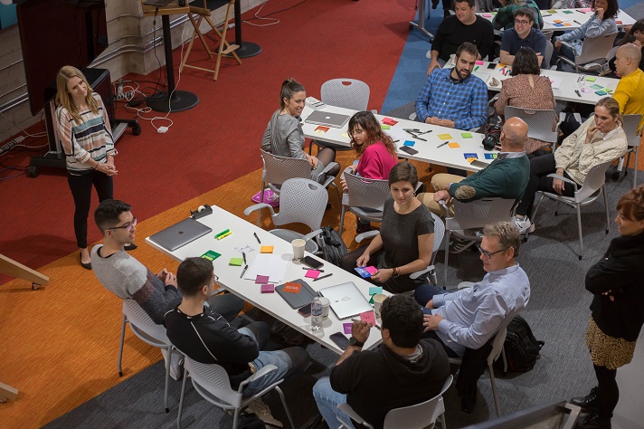
And if this is already a challenge for creativity and the creation of a product with many possibilities of viability, our challenge with Google and its Design Sprint was limited to about 5 hours of work, with presentation to its team of designers including … Who said fear?
The workshop led by Kai Hayle – Lead of Design Relations and Sprint Master Academy – with the help of Jayeon Kim , begins with a short talk by Michelle Alvarez , from the Material Design Google team.
Michelle showed us all the elements that make up her Design System and about the why and evolution of the entire design kit that Google uses. He also showed us all the sources and resources that the company disseminates and how they could be used for the prototyping task and the workshop presentation, and in many other projects.
After a fun ice breaker and a review of the bases of the Sprint comes the challenge: Create an app that connects designers with non-profit organizations, with the idea of covering design tasks and that can be implemented throughout 2019.
From this context it is time to do the same in a Sprint process, so that at the end of the workshop a brief presentation and solution proposal would be ready to show to the team of designers.
Briefly, this was how a Sprint was worked in record time:
Understand the context
Starting with research and information gathering, which translates into a way to turn a frustration or problem into an opportunity.
To make this phase more real and viable, the Google Academy team provided us with information about professional profiles seeking volunteer work, and we completed it with brief interviews with colleagues who have collaborated with an NGO.
Define the problem
It is time to add creativity and share the various value propositions that come to mind, without filters or prior evaluations, capturing ideas on post-it.
Sketch out
After a brief selection of the ideas that most convince us, it is time to develop them through a small sketch or storytelling where we land the most, the potential of the value proposition.
It is what is known as the Crazy 8’s , where by folding a sheet of paper into eight parts you have all the space necessary to develop the idea.
Decide
After a final vote, it is decided which is the best proposal and which will go to the prototyping phase.
Prototype
It consisted of creating a brief prototyping of the proposed app, using Sketch and the Google design material, elaborating the key wireframes to show the usefulness of the application.
Validate
On this occasion, the validation of the idea consisted of feedback from the designers , to whom we had to “sell” our app proposal and explain how we had transferred the detected problem to a viable digital solution.
The result? A great ovation to all the teams for the ideas developed and reaching the goal.
LinkedIn: How do you manage a team of more than 100 designers?
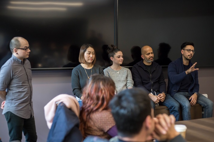
We attended our appointment on LinkedIn with Robert Surrency , Senior UX Designer and the most charismatic professionals you can find, who together with Christina Wharton await us for a meetup with different professionals from this referring networking platform.
This talk would give to write a whole book on ways to align objectives in companies with so many teams, professionals and present in so many countries, how has their evolution as professionals been to end up working there, or what are the work methodologies to coordinate more than 100 designers specialized in User Experience.
Among all, we are left with the contributions of Oscar González, in charge of Design Systems for LinkedIn , who shared the challenges of creating design documentation that was valid and integrated by all teams and departments.
Its system or guidelines are disseminated through an internal website, with all the material and ways to streamline and unify styles in the creation process, to facilitate the next step with developers and testers of the new features.
Designing for the greatest: The experience of Jordi and Bernardo
In full mental effervescence for everything lived to date, we stayed with Jordi Verdu and Bernardo Núñez .
The first of them, a Valencian already settled in San Francisco as part of the Google team, a goal he achieved by putting a lot of passion in everything he does and being very curious. For him, this was the magic formula that led him to enroll in the ambitious Google Photos project.
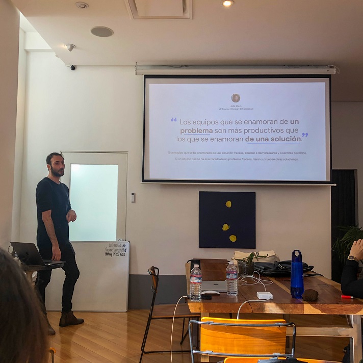
The conclusion of the design for Jordi is very simple, as well as revealing: “Fall in love with the problem, not the solution.” And along with this, how do you find a way to present designs and create interactions that are easy for development teams to understand, key to the realization of all solutions.
For his part, Bernardo has been working at Google for more than 5 years and has currently joined the YouTube division , where he takes advantage of all his baggage in projects such as Bump or the one carried out with Area 120 – Google’s incubator – in the who developed the Kormo app , which highlights the importance of the research and testing stage of any analogue or digital product.
And how to cover these stages without the resources and time being the most relevant? Well, as he says ” being scrappy “, or what can be translated as adding a dose of ingenuity and practicality in the prototypes to be able to continue advancing and iterating until the final result is found.
Origami Facebook: Where have you been all my life!
Last workshop of this creative adventure by Cristóbal Castilla , Facebook Product Designer specialized in UI Motion Design and in charge of developing the prototyping tool, Origami Studio.
Origami Studio is part of the Design group area of the Facebook group, which is created to provide service and solutions to the problems faced by the designers of this company and as a way to create an interaction software that brings together everything that Facebook needs. , Messenger or Instagram.
Given its usefulness and relevance for the development of interfaces, Facebook gives access to this software -for free- to anyone interested in using it, and it is just a sample of all the functionalities that the internal tool they use covers .
Cristóbal is perhaps one of the most experienced experts in digital interfaces and with the most professional baggage, so it is very important to take into account the relevance that good prototyping gives in the world of design and development, and that we can only ratify by our experience in the programming and development phase of a digital product.
Employ Origami or other many software prototyping there depends on each professional and business philosophy, but the added value of Origami is that it is less limited when introducing animations and create r a trial version that allows greater interaction and detail. Obviously, this translates into a better way of communicating the product preview and, therefore, of receiving feedback and involving the rest of the teams involved in the process.
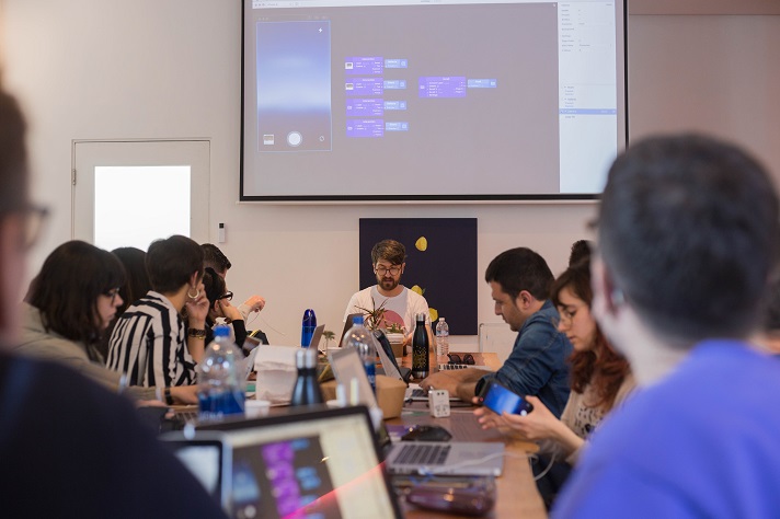
Christopher convinced us of all the advantages of Origami when it was time to practice. The process involves being methodical and starting by organizing the layers very well to be able to select them without problem and add the interaction that we need in the prototyping.
Basically it is about creating a flow that begins with the layer where you enter the type of interaction desired -scroll, swipe, … —, is defined with the values of the patches -patch- to customize the behavior of the interaction and is linked to the corresponding property.
Once this part is finished, it is time to preview and share the prototype. For this, you have Origami Live, the app linked to this software that allows you to transfer the prototype to any type of device and use it.
If a single designer can do this whole process with a single tool, it is easy to imagine the potential of this, not only for pretesting internally or with a group of users, but also its practicality for developers who have to program all the interaction responses.
Because another of the remarkable learnings, which continues to be a challenge for all these large companies and who work on it daily, is to find ways to improve the way designers and developers work , with the aim of streamlining processes and creating a more practical communication and documentation for everyone.
With the Origami workshop, this trip was full of exchanges of ideas, networking and creative workshops, of course, all this enlivened with some time to tour the streets of San Francisco and enjoy the unforgettable moments that travel in group.
In conclusion, an invaluable experience with a group of professionals with great potential and who has given to learn and laugh a lot. Now it is time to start shaping new ideas and that we can enrich your project with all this. Ready to tell us?
