In the current digital age, online pages are the presentation letter of brands, so knowing how to choose the right web design is more than essential.
Web design is what brings to the page the visual elements that identify the company and convey its corporate identity. And according to the location, color and amount of elements it integrates, to a greater or lesser extent, it is possible to capture the user’s attention and obtain certain benefits.
Among the types of web design is the flat web design. It’s a minimalist approach that puts the focus on content and has certain advantages, such as usability and a positive impact on your SEU.
What is flat web design?
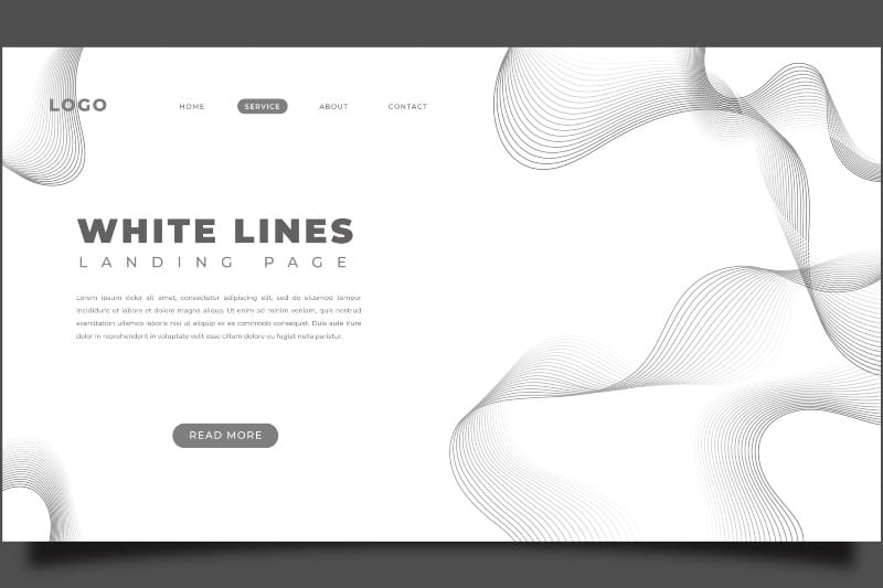
Flat web design, or flat design, is a design trend that uses simple, sharp shapes, with bright and sober colours to create two-dimensional 2D elements, which adapt both to the web interface like that of mobile devices.
It is a web design style that sets aside unnecessary elements that can create a 3D appearance, such as textures, shadows, and gradients. Focusing mainly on typography and color.
The main characteristic of a flat web design is its simplicity. Because it contains less information and offers the possibility to improve the speed of load of the page.
Characteristics that define a flat or minimalist web design
Using flat web design you can create minimalistic, elegant, attractively designed and amazingly styled online pages.
But, as in all design, it is essential to ensure that the characteristics of this style or trend are appropriate for the audience.
The main characteristics that define flat design are:
- Simple shapes. Flat design uses simple, two-dimensional vector art to represent objects. Eliminating any complex image or realistic effect.
- Minimal textures. Textures are minimized in this type of design. Images are 2D, do not contain shadows or complex gradients.
- Bright and limited colours. Minimalist web design uses bright colours to send visual cues to users, creating emotional bonds with them. Usually, few colours are used which are carefully chosen. Many times going so far as to use a monochromatic design.
- Simple typography. To facilitate reading, in flat web design it is usually used:
- Typography sans serifs, that is to say, without the small final stroke that adorns the ends of typographic characters.
- Large size font.
- Very short and direct titles/subtitles.
Advantages of a flat web design or “flat design”
The flat web design is a trend that has gained strength thanks to its following advantages:
- Improve usability
The flat web design makes the page easy to navigate. This style does not have complicated elements or excessive decoration, so it shows the user what he is doing.
lment you need to see and understand to make use of the online platform.
-
- Helps to get higher conversions
Minimalist web design, being so simple, eliminates any unnecessary elements that could cause distraction to visitors. Which facilitates the visual exposure of tools that favour conversion.
For example, subscription boxes or buttons that redirect to purchase become more effective because they don’t compete with decorative elements. This is also helped by the use of vibrant colours.
-
- Encourages the increase in loading speed
The flat web design uses simple graphics, therefore the size of the files it uses is small. Which has a positive impact on the speed of the page, by making it load in less time.
Consequently, the flat design also helps to offer a better user experience and to raise the position in search engines.
-
- Adapts to web and mobile interface
The flat design uses scalable vector graphics, so resizing them is an easy and fast action for browsers. Becoming a highly efficient design to give the page the ability to adapt to the screens of mobile devices, without the loss of any element.
-
- Facilitates web maintenance
On a programming level, it is easier to develop a simpler interface. And the same happens with maintenance. As simple as the web design is, its maintenance will require less work.
In a flat web design, solving errors and adding content or new elements to the page is a less complex job.
-
- Makes content stand out
Flat design is a style that uses as few visual distractions as possible, using so-called “white space”. Therefore, the focus of the user’s attention is directed to the text.
It is a design that uses contrasting colours and a typeface with large and easy-to-read characters, making the most important texts or fragments of content stand out.
-
- Helps SEU positioning
A minimalist design offers a simple interface and graphics that facilitate fast page loading. It also facilitates a perfect adaptation of the web to the mobile interface.
All these potentialities are taken into account by search engine algorithms. As a result, pages with a flat web design can achieve better SEU positioning.
The overall goal of flat web design is to simplify the user experience and remove points of distraction. It is a style that helps to prioritize the content and convey the message in a clear and simple way. It is an excellent choice for brands that want an easy-to-navigate online page.
Flat web design is also attractive to the eye, it is a minimalist design that doesn’t go out of style and that you can implement whenever you want. Because it is always possible to redesign the interface to facilitate the user experience.
At Doowebs we are experts in web design. We advise and assist you in the development and design of your website, your e-commerce or your corporate website. Tell us about your project and we’ll help you create it.
➔ You may be interested: The importance of design for the success of a web page.
